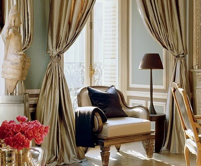
The room needs some additional architectural interest since there is little room for decorative detail and I am planning applied moldings over the chair rail to create the feel of paneled walls. The moldings will likely be the same color as the wall, but will just add some oomph and structure and provide a place for smaller hung art and sconces. Here's a round-up of some inspiration images I've been scouting.
(I've lost the sources for the above two images, if anyone knows, please let me know)
Bunny Williams design for the Edith Wharton House - my pic taken 2009
These images are so pretty they make me want to weep - via Trouvais
via Decor Pad
via Cote de Texas
via Diane James
Carter and Co. design via Michael J. Lee
Bunny Williams dining room via Diane James
Larry Laslo design via Architect Design
Timothy Corrigan design via Decorati
Timothy Corrigan design via Decorati
Mary Drysdale design via Decorati
And here are my design ideas of two walls.
With thanks to Carol Ann for her suggestion, I changed the design for the moldings on the elevation above and it's so much better I think (see below). Thanks Carol Ann!
The chairs are the Restoration Hardware Martine chairs, but they've sadly changed out the original elegantly finished legs for these rough hewn oakey ones, which has rendered these chairs neither here nor there design wise, in my opinion. So, chairs are still be decided upon, but they give an idea about the direction we're headed in.
Thoughts?


No comments:
Post a Comment